Welcome back, guys...it's been almost a week since the last post in which I wrote down some of the best ways to practice HTML and CSS. Hope you have tried at least some of them including Free Code Camp. Now let's move forward learn some important things in CSS.
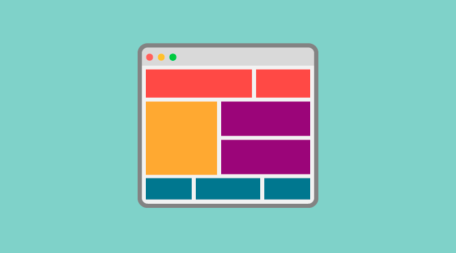
Till now we have created so many CSS elements but they all miss one common thing in them. They are not responsive. Yes, all the components look good on our desktop's full-size screen but if you look them on mobile devices, they are really bad. That's where CSS Grid comes into the picture...
What is CSS Grid?
- CSS Grid Layout is the most powerful layout system available in CSS which will make layouts responsive.
- It is a 2-dimensional system, meaning it can handle both columns and rows.
- You work with Grid Layout by applying CSS rules both to a parent element (Grid Container) and to that element's children (Grid Items).
Introduction
While learning CSS to place our elements on the page, we used various things like floats, positioning, inline-blocks and what not...Using these various things really makes layout confusing and complex. CSS grid is created specifically to solve the layout problems we've all been hacking our way around for as long as we've been making websites.
Browser Support
All the major browsers including Chrome, Firefox, Safari, and Opera except Internet Explorer's old versions(😏).
Basics
To get started with CSS grid, we define a container element as a grid with display property set to value grid. We also set column and row sizes with grid-template-columns and grid-template-rows and then place its child elements into the grid with grid-column and grid-row.
That's all for today. In next article, we will first see some basics terms needed for understanding CSS grid and then we will move deep into how to code it. This is the little bit long topic but once's you understand it, responsive websites are just thought away.
If you have any doubts, feel free to comment or mail me.
and yes, #keepCoding.
Comments
Post a Comment